Website Relaunch
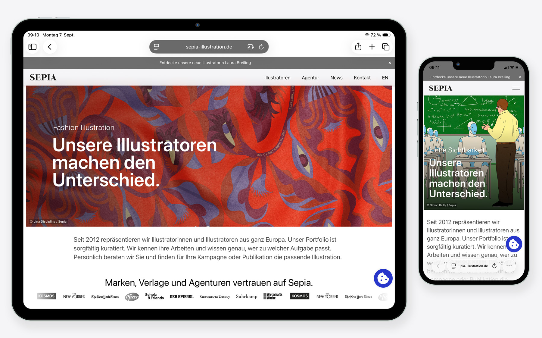 © André Laame
For the illustrators’ agency Sepia, I update the website every year to keep it up to date.
What has changed?
First of all, our goal was to make the website clearer and easier to navigate. We therefore decided to use the slightly clearer Santa Fe typeface.
Navigation
Below, you can use the buttons to navigate directly to the skills or to the illustrators. We decided to add painting as a skill because we believe that craftsmanship is becoming particularly important in the age of artificial intelligence. Once you select a category, related categories are now displayed. For example, selecting “Book” will also display a “Children’s Book” button.
FAQ
We have also added a new FAQ covering questions about bookings (commissioning, timing, licensing, and much more).
Booking Form
This form has a very simple structure and is supplemented by a PDF for more complex projects.
Guide for Applicants
If you are interested in being represented by us, you can find out more about the benefits here and learn how to apply.
Multilingual
Depending on the region you are in, the content is displayed in either German or English. If you are in England but would still like to view the German text, you can continue to switch to it using a button.
Creative Minds
We wanted to put the illustrators more at the center of the website. You can find photos of them in the “About Us” section, as well as a short introduction in each individual portfolio.
GEO
Die Inhalte sind für Bots klarer strukturiert.
News Bar
A news item is now featured right at the top of the header.
Slide Show
Three images are displayed in rotation, each accompanied by a different text.
Einfache URLs
Die URLs werden im Hintergrund automatisch gekürzt.
Learn more about my creative strategy.
Visit Sepia.